
One of the questions we have heard since the beginning of KumoMTA has been, "Where is the reporting web UI?" We almost always answer this with our own question, "What do you want in that web UI?" And everyone has a different answer. So, how can we possibly justify developing a single interface that will satisfy everyone?
The answer is that no one can possibly provide one reporting WebUI that satisfies every user's need. Instead, we have gone back to our core values and central focus of providing a powerful MTA with high visibility and flexible integrations. The solution was to expose a ludicrous number of data points through our metrics API that can be consumed and viewed by tools like Prometheus and Grafana. The result is a flexible, API-driven solution that can be customized to suit almost any visibility need. Any utility that can consume the metrics feed can make use of this data and present it in any format you need. Below is just one possible configuration captured from our own demo system.

Imagine having near real-time visibility into not only queue depth, but also the remaining drive space on your spool volume, along with CPU and memory consumption in a single view. As you can see above, you can re-use metrics to do things like show the breakdown of scheduled queues by domain in a complex line chart, but also aggregate that into a total gauge as an overall number.
Nearly every email engine available will show you a graph of receptions, deliveries, delays, and bounces - we considered those a given (table stakes) and wanted to explore what mailops engineers at the largest senders were looking for in addition to the basics. The result of those conversations led us to expand the native KumoMTA metrics well beyond normal email stats to include data points like lua_event_latency, thread_pool_size, and disk_free_percent, to name only a few. More than 100 different metrics are now directly from KumoMTA. When you combine that with Prometheus node_exporter data, you have enough to fill a few pages worth of valuable system metrics that can be stacked to show you a view of your entire cluster.
As a mailops engineer, KumoMTA can enable you to observe near real-time status of your entire cluster in a single view or as finely detailed as you need. This can include detailed delivery metrics, storage volume status, memory and thread use - everything you need at your fingertips.
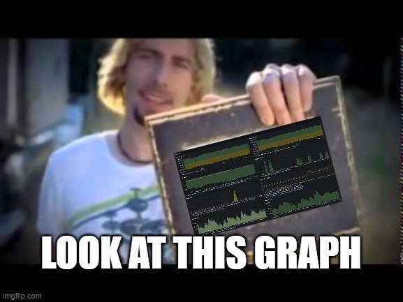
Configuring this is simple and fully documented here. Following these instructions will get you the KumoMTA sample dashboard seen below. You can, of course, modify it at will using Grafana's well-documented section on panels and visualizations.

|

|
Let us know if this helped you. We would love to tell your story.
------------------------------------------------------------------
KumoMTA is the first open-source MTA designed from the ground up for the world's largest commercial senders. We are fueled by Professional Services and Sponsorship revenue.
Join the Discord | Review the Docs | Read the Blog | Grab the Code | Support the team